Simply Find
A responsive web app aimed at improving the process of searching and buying homes by providing users with the information needed to make informed decisions.
The Project
Investing in real estate or searching for a forever home is already a big decision, so finding the perfect place shouldn't be an additional obstacle. Simply Find is a responsive web app designed with people in mind. By providing necessary information to make informed decisions, a straightforward messaging and scheduling system, and an intuitive dashboard, Simply Find's goal is to simplify home buying.
Role
UI Designer
Timeline
2 months
Toolbox
Figma, Photoshop, UsabilityHub, Lucid


OVERVIEW
Purchasing real estate for personal and investment purposes can be an emotional and complicated experience. For first time home buyers, the search alone can be intimidating, and I started to wonder...
What resources exist for first time home buyers? How can the search process be made more efficient and less daunting for first time home buyers? How can this all be done while balancing life's other challenges?
Insights
-
Easy to access and specific search filters to narrow down property searches
-
User dashboard to quickly access saved searches and properties upon logging in
-
Relevant resources and learning materials to help new homebuyers and investors better understand the market
-
Efficient messaging system to contact agents when ready to view property
Goals
-
An efficient way to search for and view properties
-
To save and return to properties of interest
-
To receive relevant information about properties and their areas
-
To be provided with information to help make informed decisions
-
An easy to use platform that can be accessed on the go

SWOT analysis representing overall findings of 3 competitive analyses
CONCEPTUALIZATION
In preparing for the development of the user interface, the next step was to map out user flows. These key features were opportunities previously identified in the initial research. Creating user flows allowed for better visualization of individual screens that users would interact with to complete their goals, which were then organized into a sitemap.
Objective 1: As a new property buyer, Raymond wants a tool that can help him find a property that meets his needs so that he can provide financial security for his family.

Objective 2: As a busy father, husband, and professional, Raymond wants to quickly save and return to properties of interest so that he review each property in depth when time allows for it.
.jpeg)
Objective 3: As an interested property buyer, Raymond wants to contact agents to ask questions and to set up viewings so that he can view the property in person.
.jpeg)

DESIGN
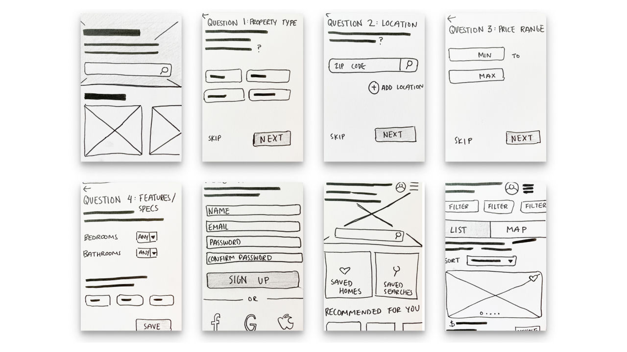
With a system of organization in place and the required screens determined, it was time to start the design! Low-fidelity wireframes of main screens were designed and then enhanced in Figma to create mid-fidelity screens. A mobile grid was specified to maintain consistency throughout the design, and the first iteration of Simply Find's prototype was developed from the mid-fidelity wireframes.

Check it out! Simply Find's first prototype included account setup, search and save options, messaging and scheduling.
1. Create an account
2. Search based on location
3. Set search filters to narrow down properties
4. Save search for future use
5. Add property of interest to favorites
6. Return to dashboard to access saved home
7. Schedule a viewing.
USABILITY TESTING
Before adding additional UI elements, a series of usability tests were conducted to assess the usability of the main features. My goals for testing were to ensure that UI elements were easily recognizable and allowed for the seamless completion of each task.
Test Objectives:
-
Can participants recognize and navigate through search and save features?
-
Observe if participants could navigate back to main dashboard to access saved materials. Do participants recognize the top bar as a navigation element on mobile or is secondary navigation necessary?
Goals:
Observe if users are able to complete basic functions such as creating an account, searching for a home at a specific location, requesting a viewing, and returning to the main dashboard to access saved searches and homes.
"I wasn't sure how to get back to see what I saved."
"I don't know what the dashboard is. How do I get there?
"It was fairly straightforward. I could see where I needed to go to set filters to search for what I wanted."
From the results of testing, it was clear that some changes needed to be made! Assumed mental models led to navigation confusion. 3 of 5 participants did not recognize the site logo as a pathway to the user dashboard. To remedy this, a second pathway was incorporated within the navigation menu. There was some confusion in differentiating between the site's landing page from the user dashboard, but I did not consider this to be a usability issue as final mockups with additional UI elements would likely add clarity. Now back to the design!
A: 70%


B: 30%


In a preference test with 10 participants, Design A was chosen as the favored palette.
ITERATION
Along with making the necessary changes in user flow to improve usability, it was also time to decide on the visual direction. Partial branding guidelines specified a "clean, quick, and smart" interface with greens and blues. I created two mood boards to begin the process of giving Simply Find a unique voice. Both designs reflected branding guidelines but differed in the interpretation of the needs of the proto-persona.
In the end, I opted for Mood Board 2. The bold accent color and sharper edges felt more urgent, demonstrating efficiency and quickness. The palette also consisted of a common color combination, making the appearance familiar and more user-friendly, and the sans-serif font felt cleaner and more professional.


I began experimenting with variations of the color palette by applying each palette to a few key screens. Design A consisted of a slightly brighter variation, while Design B took a more playful approach by incorporating an orange accent. A preference test yielded statistically significant results in favor of Design A.


STYLE GUIDE
A style guide was created to wrap up the project and to inform future iterations of Simply Find. Within the style guide, future designers can locate information on color, typography and type scale, imagery, mood, tone, and a general guideline of dos and don'ts. While the document itself will likely continue to evolve with the future of Simply Find, it serves as a basis for recommended branding.
CHALLENGES & REFLECTIONS
This was an enjoyable project, but not one without challenges. The most considerable challenge was working out how to create a clean and minimalistic design with extremely text and image heavy content. From the start, I knew I wanted to avoid photos of homes in brand imagery, as this would too closely resemble potential future postings. On the other hand, an abundance of vectors and illustrations could potentially lead to looking unprofessional or too playful for the branding. It truly was about finding the right balance, which I believe was achieved in the final mockups.
An additional, unexpected challenge was in designing empty states. It was easy to visualize how the dashboard would look when it was full of beautiful homes and saved searches, but in creating the prototype, I wanted it to represent what a brand new user might experience.
WHAT'S NEXT?
In future development, I hope to continue research to uncover what specific information homebuyers seek when using the service. With a desire to keep the user in mind, the goal is to present relevant and valuable information for making home and property buying decisions. Also, when considering all stakeholders, another phase of the project would be to research and design from the agent/seller perspective.

Try it out!
Here's what you can do...
-
Create a new account
-
Search for property listings in Big Bear, CA
-
Set and save search filters
-
Explore and save property located on 123 Moonridge road.
-
Send a message to an agent
-
Book a viewing for tomorrow at 11:00am.
-
-
Manage saved listings

Thank you! 🤗
Mood Board 1
Mood Board 2


In the next phase of the design, imagery and iconography were developed to align with specified branding and tone. With a clear visual direction, the final mockups began to take shape, and UI elements were applied to all breakpoints.
Problem
New homebuyers with busy schedules need reliable and efficient ways to search for properties and book viewings to make informed purchases.
Solution
By designing a website that presents relevant information, the ability to schedule appointments with agents directly, and a dashboard of saved homes and searches, potential homebuyers can stay organized during their search.
Knowing that many platforms of this kind already exist, a competitive analysis was completed. In addition to noting the strengths and weaknesses of competitors, I focused on identifying opportunities within the market. After researching three competitors, findings were compiled to represent overall strengths, weaknesses, opportunities, and threats.